Overview
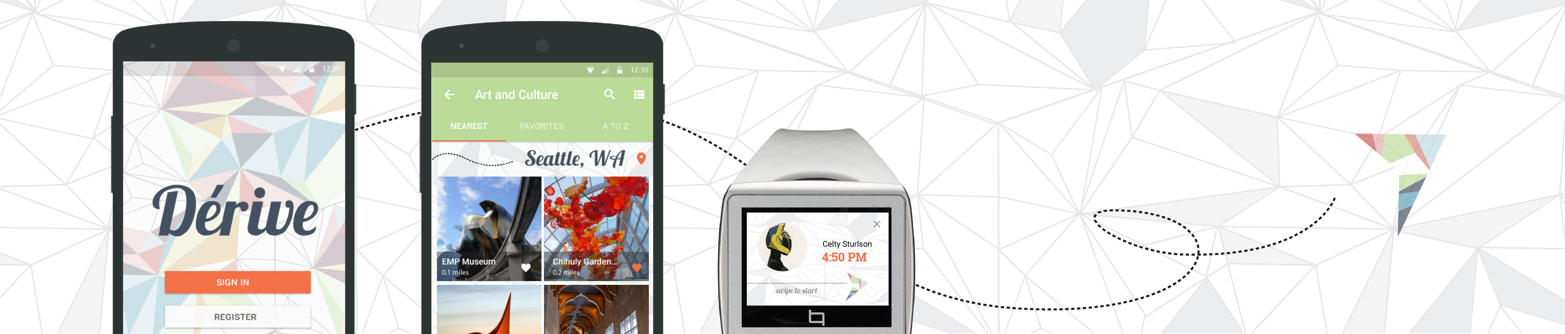
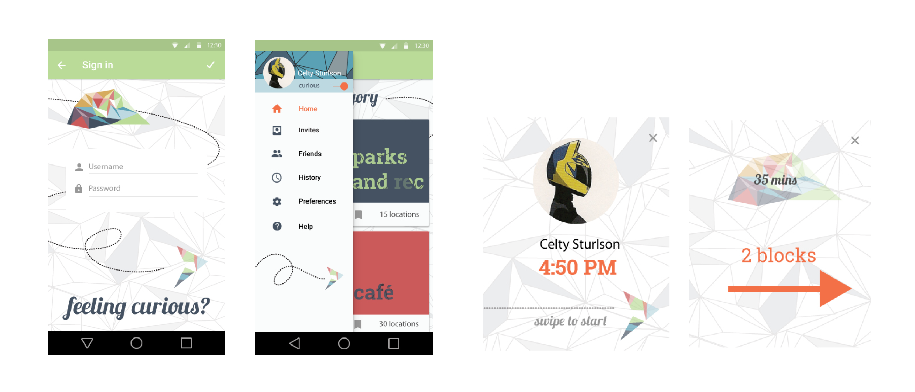
UI design for a hypothetical navigation application based on the Situationist’s dérive , where one “drifts” in an unplanned way through a city, subconsciously guided by the architecture and geography of the surroundings.
Users of this application can choose a location, invite friends to dérive to the destination as well, and then select the kind of wandering experience they would like to have before arriving at their destination. In contrast to most navigation applications, which give you the fasted route to your destination, Dérive’s focus is on crafting a unique journey to that destination.
Tools
Illustrator, Photoshop, Framer.js
Details
I really enjoyed the idea of wandering through a city, taking the time to really look at the surroundings instead of worrying about the final destination. I wanted the app to feel whimsical to users, with copy, visuals and interactions encouraging them to explore.
Visual Design
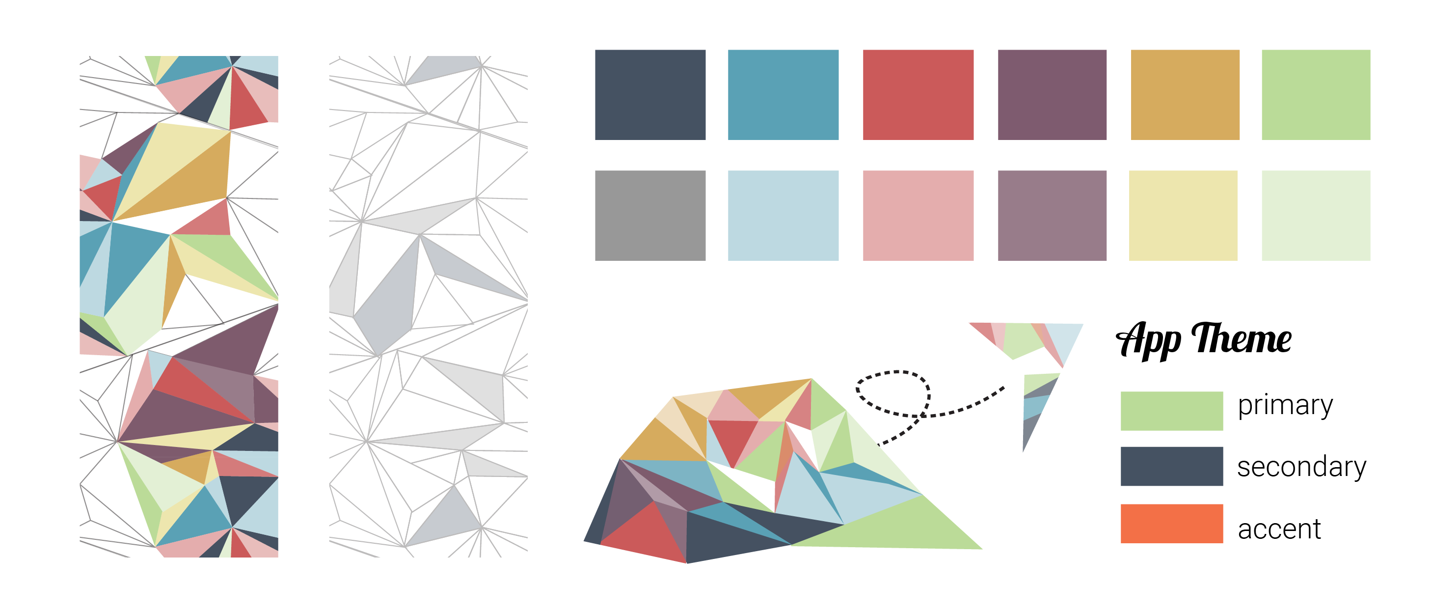
I usually start off with rough sketches of screens and how they flow together, but for this project, I started with the colors and patterns above. There are far more colors than I usually work with, because I wanted to represent the possibilities of adventure, and the many facets of a place waiting to be explored.
The plane and the island were offhand explorations I made while working on the background patterns. They fit the spirit of the app, so I ended up integrating them into the visual design. The plane helped express movement from screen to screen, and the island became the symbol for the final location.
Interactions
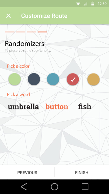
Derive is supposed to inspire exploration, so I felt a typical form with radio buttons or dropdowns would be too boring when it came to expressing route preferences. Since the prompt required that users be able to customize several different elements of the trip, a more interesting presentation would also keep users from feeling like stopping halfway through.
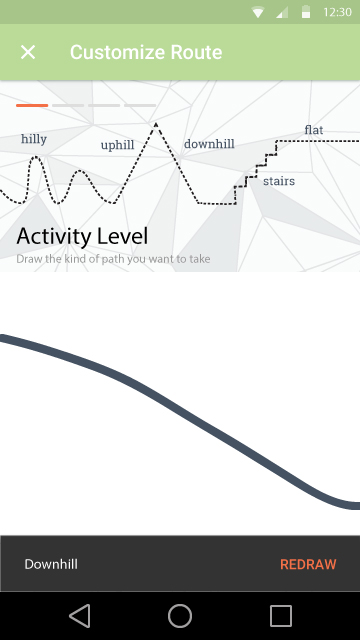
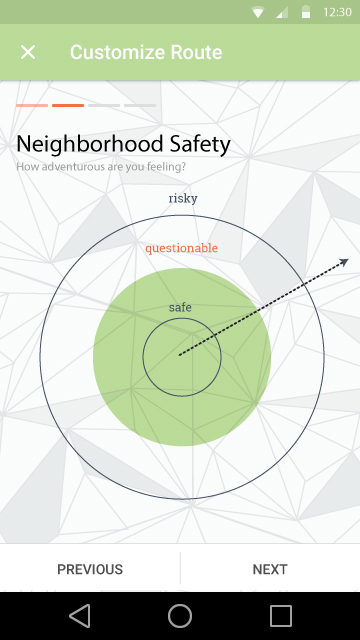
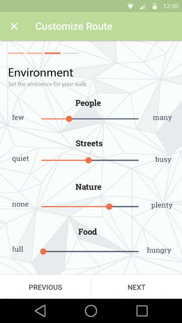
For example, the typical question for activity level is something along the lines of “light, average, or heavy workout?” When you think about energy level and typical workouts though, the intensity is rarely a constant amount. There are also physical limitations to consider; some people need to avoid stairs or hilly regions as much as possible. Being able to draw out how you’d like your journey to feel, instead of specifying these factors in words or dropdown selections would be pretty interesting.
Final Thoughts
This was my first time using Framer.js as a prototyping tool. It was a great experience being able to code interactions for individual elements instead of relying on the per-screen animations of tools like Marvel or Invision.
Looking back on this project, I just wanted to have more interesting interactions. Interesting, however, can’t really trump usability. If I had a second iteration of this prototype, these would be just a few of the questions I’d work on: Is there some kind of confirmation that the app has interpreted your drawing correctly, and a way to adjust the result? How can a user tell right now what exactly a “safe” or a “risky” trip would entail? Would a user have to repeat these settings each time they wanted to go on a derive, or is there a way to save these customizations?
Even now, I’m still in love with the concept of the dérive, probably because I find cultural landscape studies and thinking about how infrastructure and buildings impact how we act and feel to be really fascinating. It’s similar to thinking about how physical and digital interfaces influence people’s actions and thoughts.
Moreover, in this age of Google Maps and door to door delivery for almost anything, dérives would be a good reminder to savor the journey — and make the effort to have one in the first place! — instead of skipping directly to the end.