Hackster.io Project Report Full Contextual Inquiry
Overview
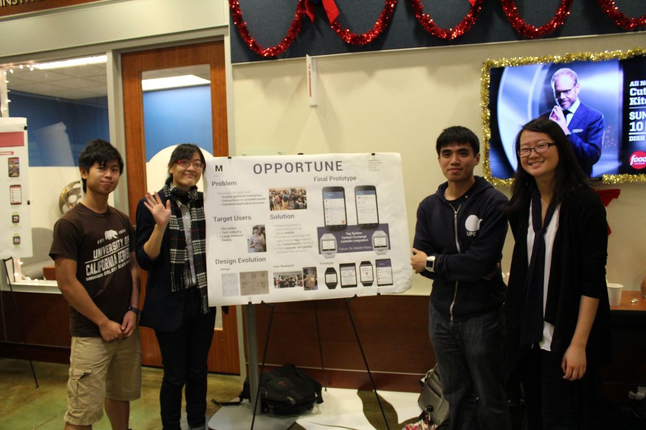
A proof-of-concept for a Qualcomm Toq smartwatch app for recruiters. Class project for CS160, User Interface Design. Worked on a team of five computer science majors; we split the roles into two designers, three developers.
Involvement
For this project I was most involved in user research and visual design.
- Participated in brainstorming and illustrated initial selected concepts
- Performed contextual inquiry with Palantir recruiters, then crafted our personas using the information
- Made hi-fi mockups for Toq watch and Android views
- Created presentation decks and led pitches
Tools
Pencil and paper, Photoshop, Illustrator
Process
Brainstorm
We brainstormed possible smartwatch applications as a group, clustering similar ideas together and building off of other people’s ideas.
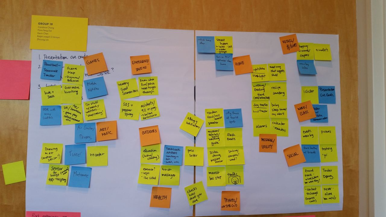
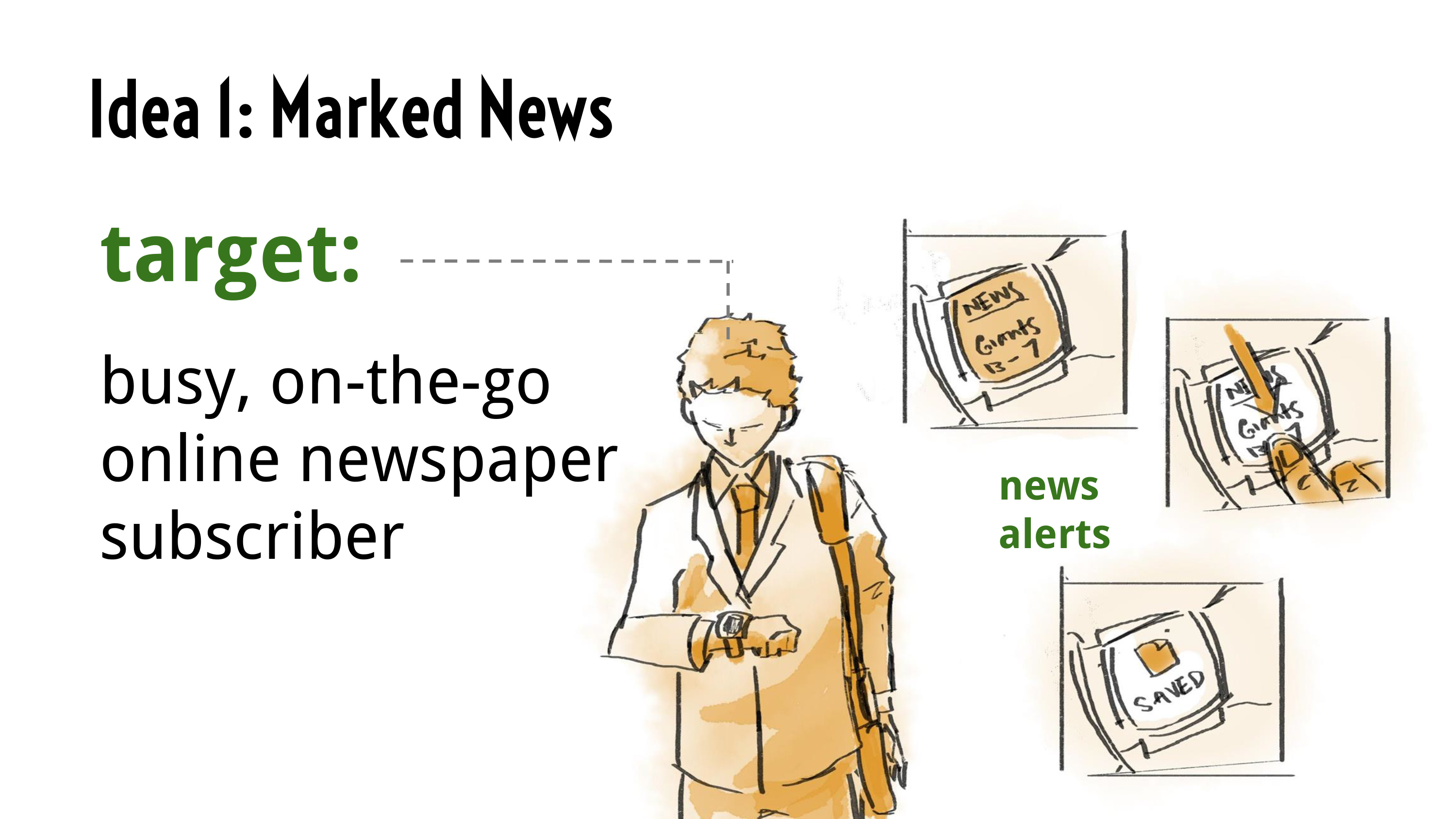
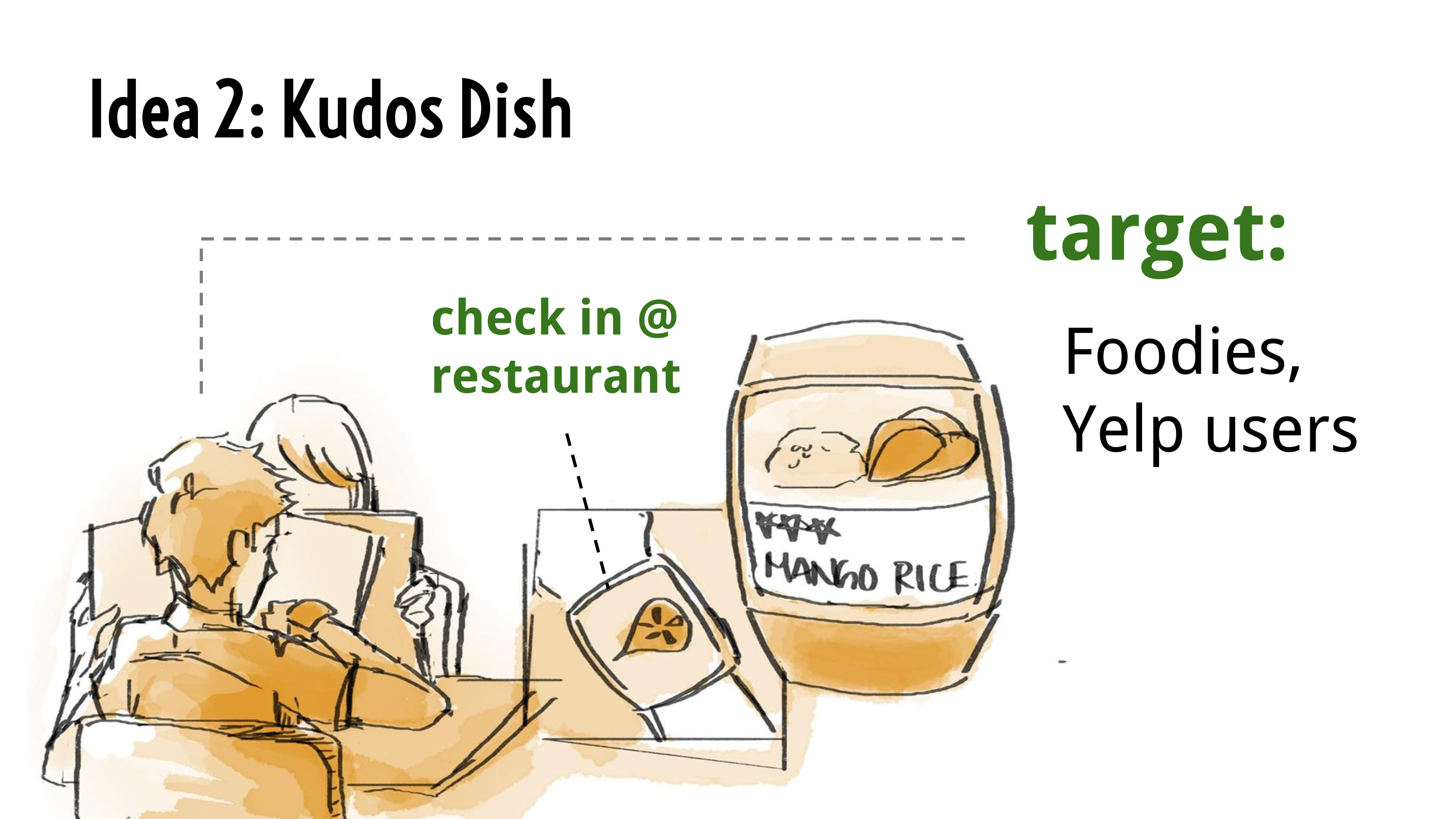
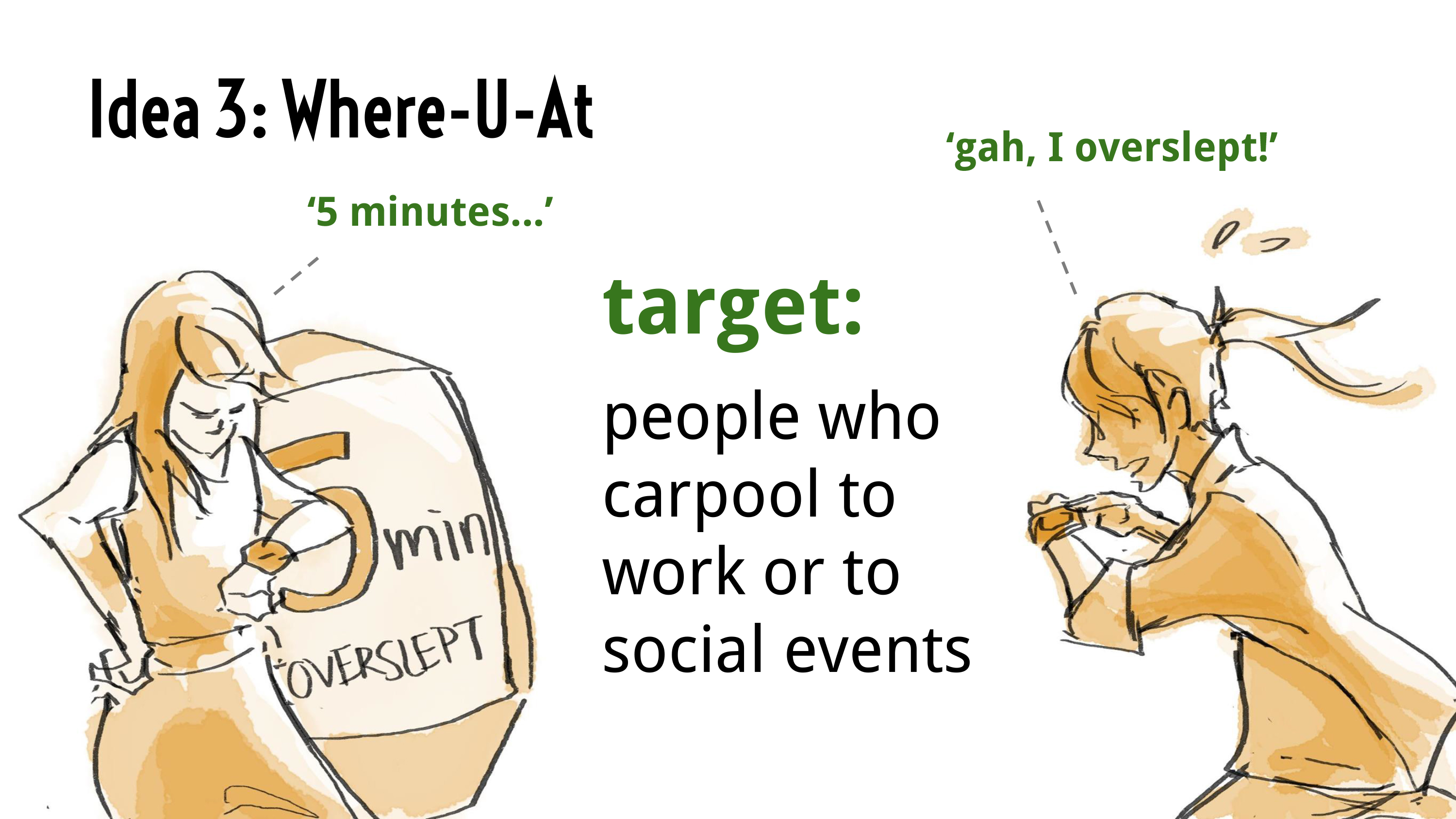
I illustrated our top three concepts to present at our initial design review. In the end, however, we chose a fourth idea that we bounced around during the review session: an app that would enable users to exchange contact information using common hand gestures. We further narrowed down our focus user group to recruiters and job seekers at career fairs.
User Studies
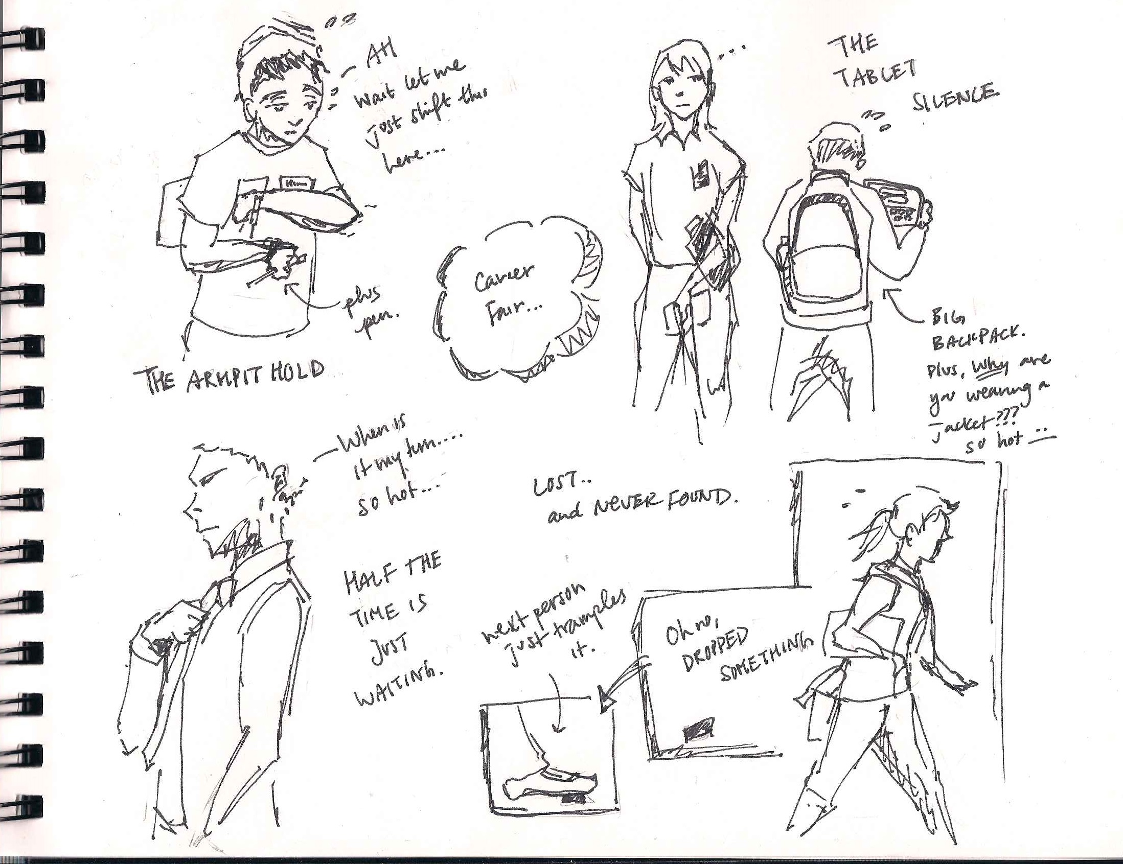
I visited career fairs to make observations and find interview subjects. Happily, at one engineering career fair, I even got permission to perform contextual inquiry with a group of Palantir recruiters. Here are some of the observations and takeaways.
Environment
Career fairs are really crowded, busy and loud. If you put something down or give something away it’s hard to keep track of it. Reaching over tables to put away stacks of collected resumes, or to just get a water bottle, is physically inconvenient. Having someone at the table coordinating is extremely useful, especially when trying to grab things or put things away is difficult due to lack of space. Getting people’s attention is difficult due to the noise. In addition, the layout and space constraints mean that even tapping someone on the shoulder isn’t an easy task.
Process
Handshake and greeting come before looking at resume. The goal is to get personal face time with candidates and carry on a conversation.
Note-taking: The engineers and recruiters take short notes, usually only three or four lines. They never write on the front of resumes to avoid bias, only the back. Palantir uses post-its, in addition to having a pen and clipboard for the resume. Post-its go on the back of the clipboard; they’re there in case there are doublesided resumes, or there are people who didn’t bring resumes and they need to write down contact info. Things to write down:
- The initials of whoever talked to the student, for later reference
- The student’s interest/possible team
- Internship/full time
- If there was a technical question, the problem and the rating
Post-fair, recruiters will have to manually scan the resumes into whatever CMS they use to track applicants. This is the part of the process that has some companies turning to using tablets at career fairs. Palantir doesn’t use them, however, because they’ve found it stalls conversations and causes backlog.
Quantitative Observations
These are rough counts.
The average number of students at the booth was 8.4. This was a pretty high number in comparison to many other booths, given Palantir’s popularity. Keeping wait times down is important because some students will just leave if they have to stand in line for too long. Palantir’s recruiters aim for five minutes per person, but it’s really hard to keep to that goal.

Things they carried: the top five ways students held their resumes
- Plastic or other cheap folder (26)
- Just papers (18)
- File folder (16)
- Notebook (7)
- Manila envelope (4)
Conclusion
Based on the findings from this contextual inquiry, as well as other user interviews conducted by teammates, we came up with a few important user needs:
- Facilitate face-to-face conversations with candidates
- Note down necessary information about candidate during conversation
- Collect all information in a way that eliminates the need for manual entry
- Manageable with only one free hand, limited movements and loud surrounding environment
Prototype Design
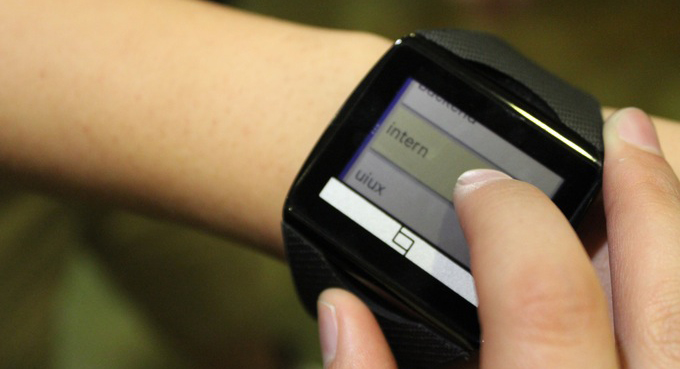
We designed our prototype to fulfill features based on the key user needs we highlighted from our studies: contact exchange, tagging, and third-party integration.
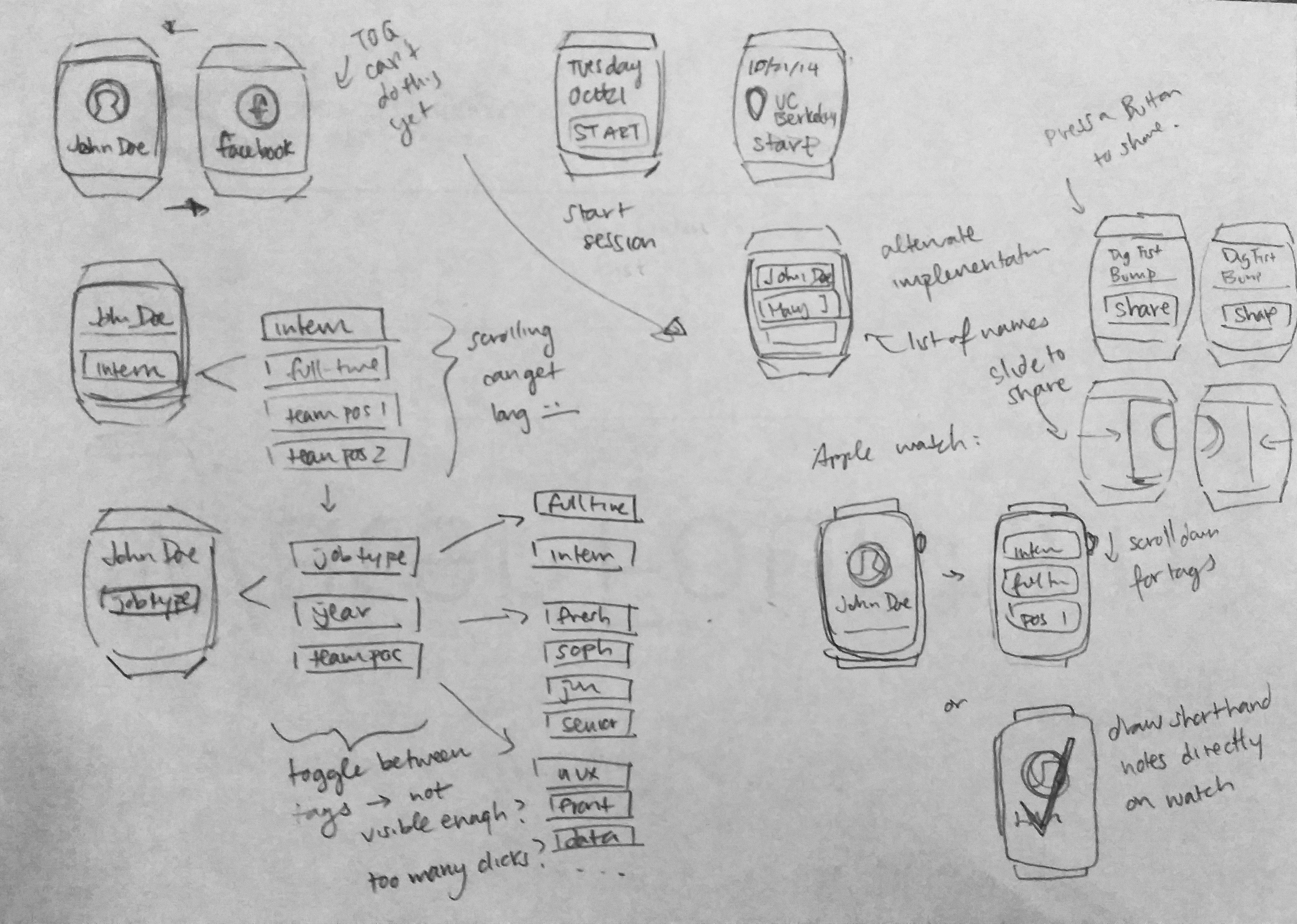
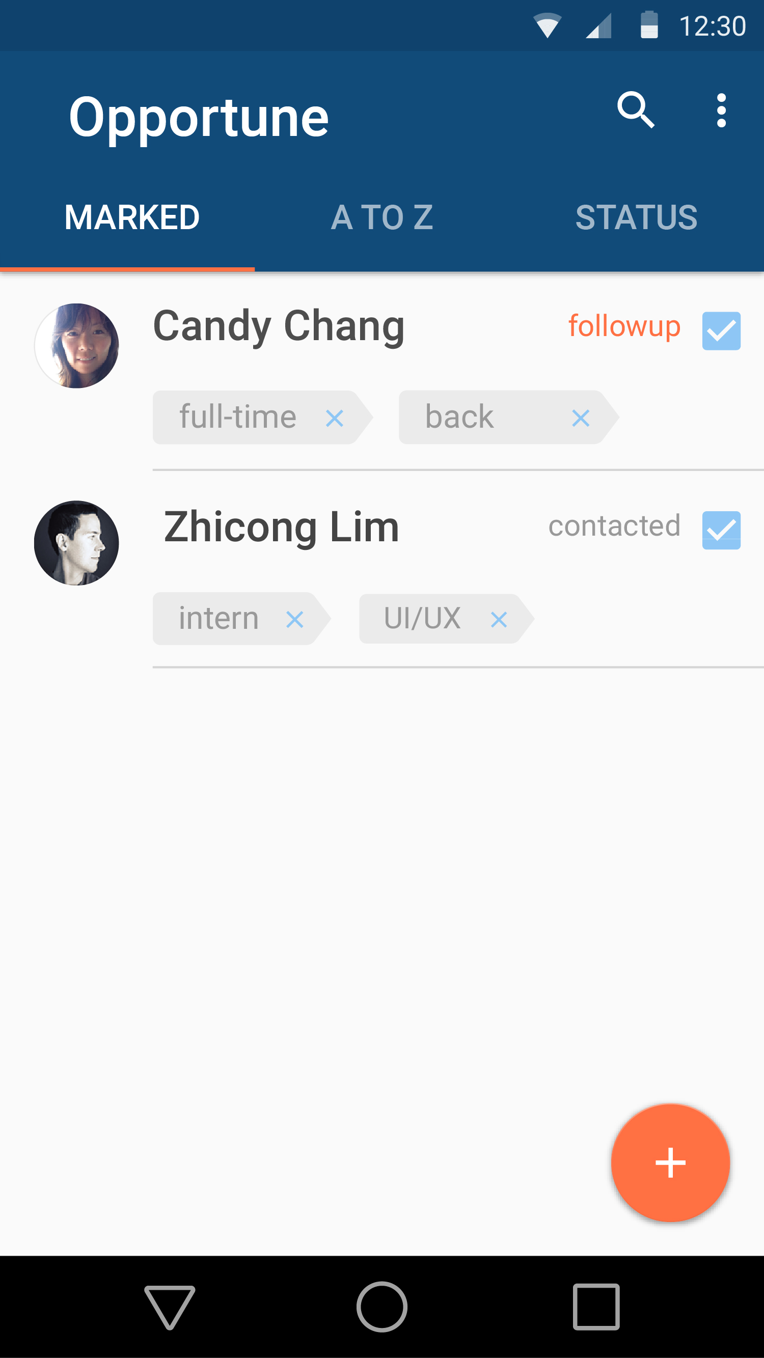
We initially hoped to implement note-taking, but given the Toq watch’s limited capabilities, as well as the small screen estate, we turned to tagging instead. This was a viable alternative, since our user studies showed that recruiters take very little notes, and they usually have predictable inputs that can be set beforehand.
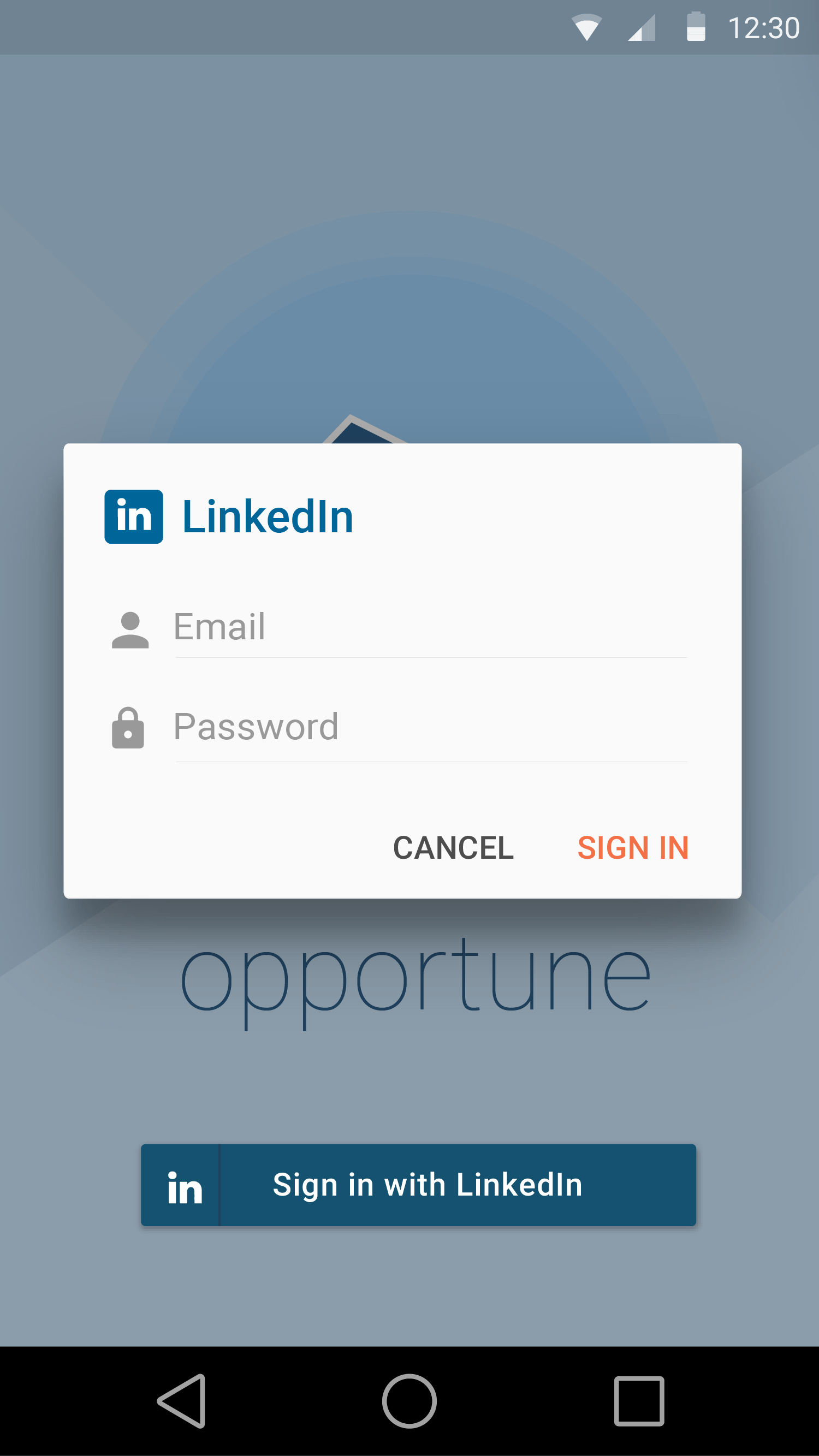
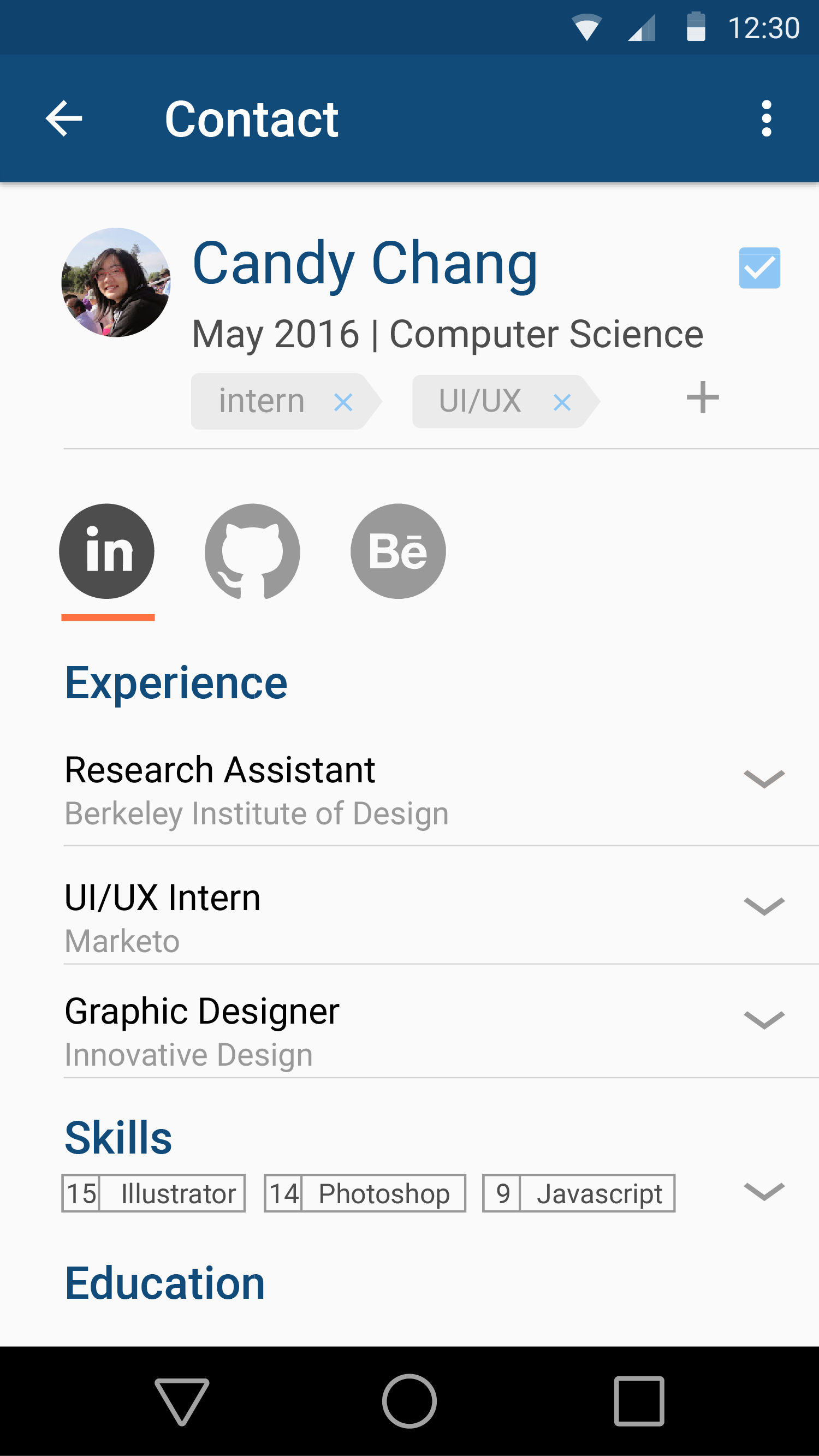
In order to make digital submission of information as painless as possible, we felt the best way was to integrate with platforms like LinkedIn, GitHub and Behance to help candidates showcase their experience and make it simple to port all the information into a company’s CMS.
UI Design
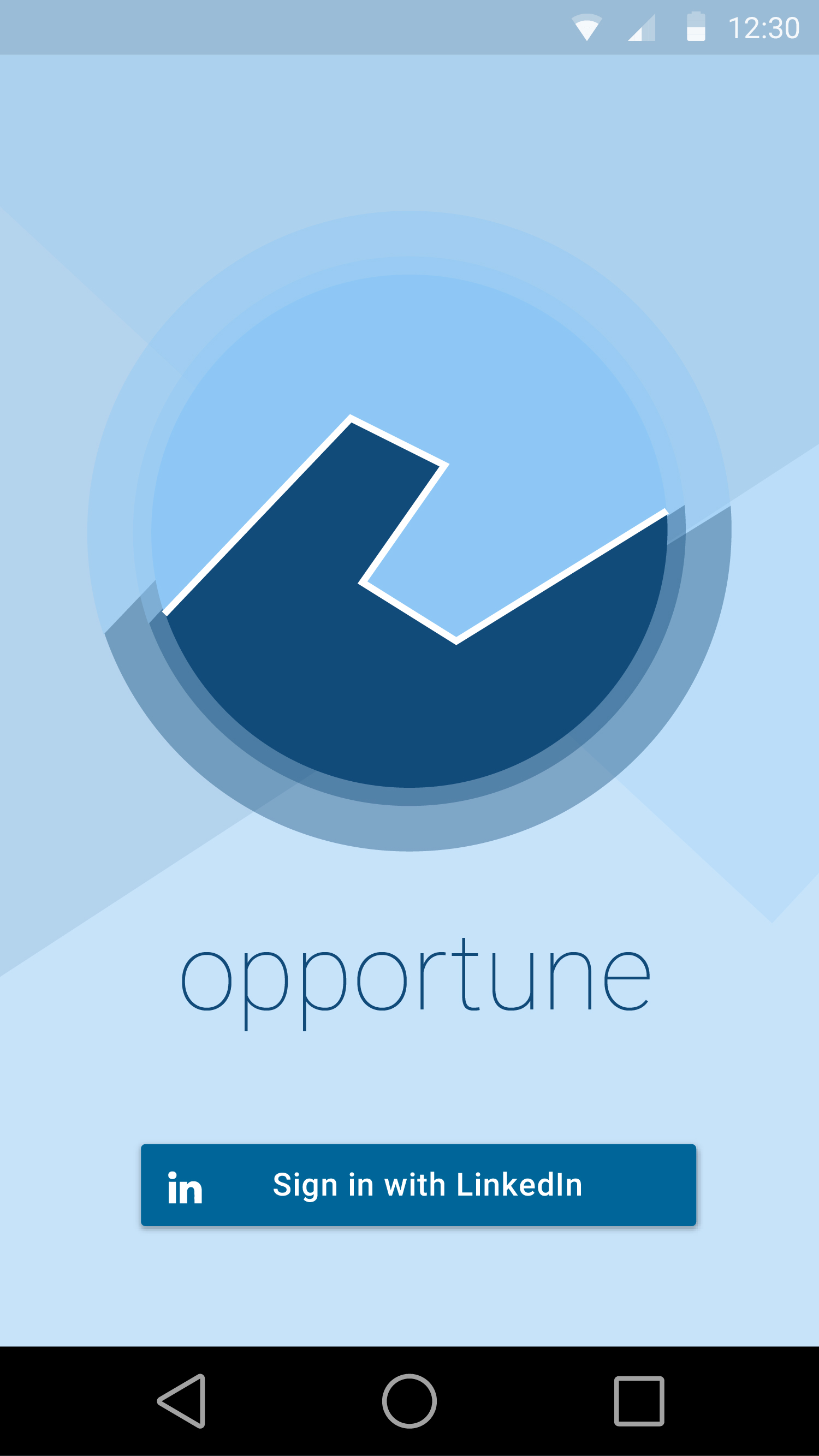
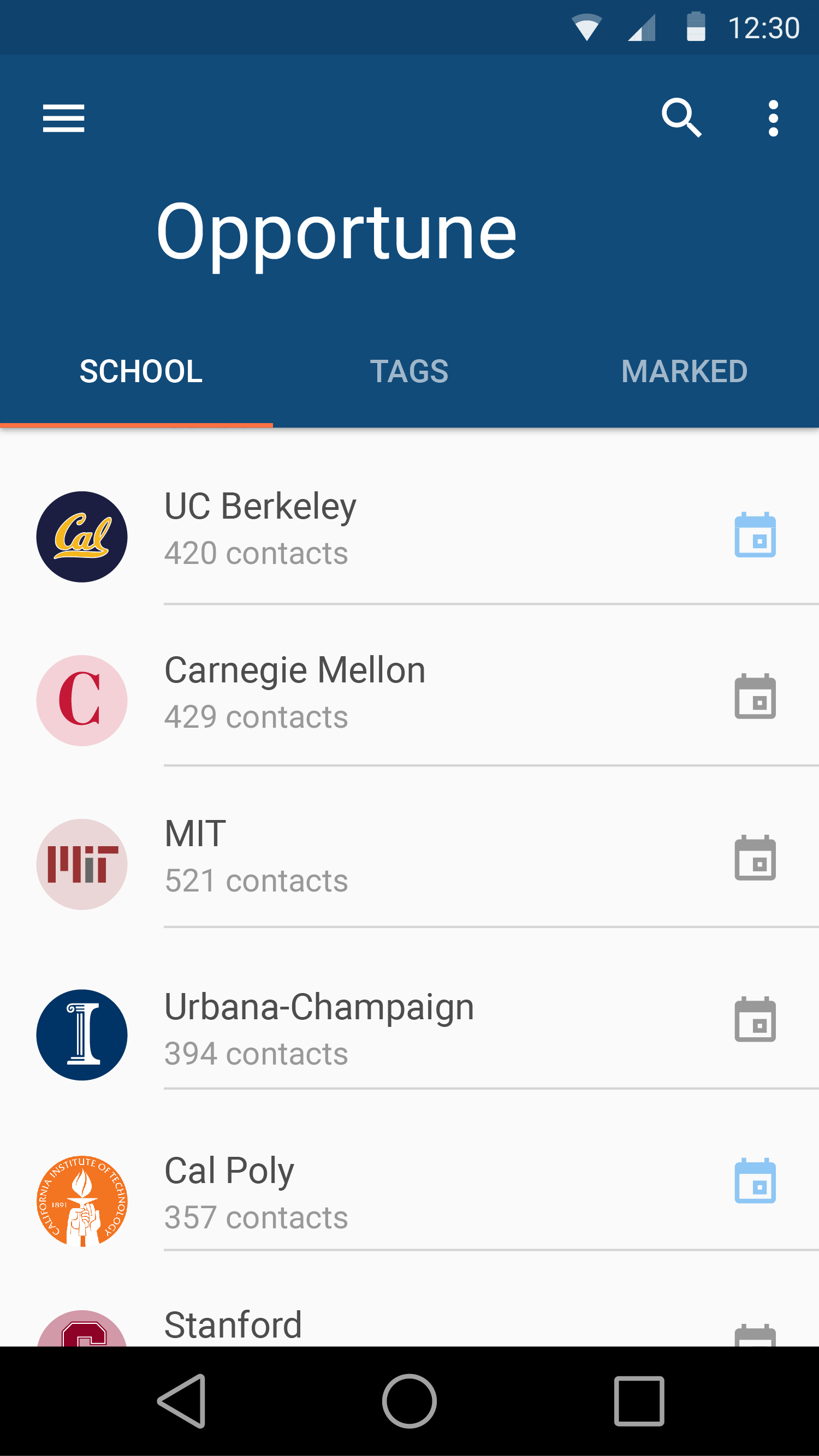
I was in charge of the visual/UI design for the prototype’s watch and mobile views. This included designing the logo: a stylized representation of a handshake.
Designing for the Toq watch was mostly about figuring out what was supported by the SDK, and what things to give up on at the design stage because of hardware and software limitations. Possible interactions like bumping watches or sliding cards across to each other were ruled out at the sketching stage.
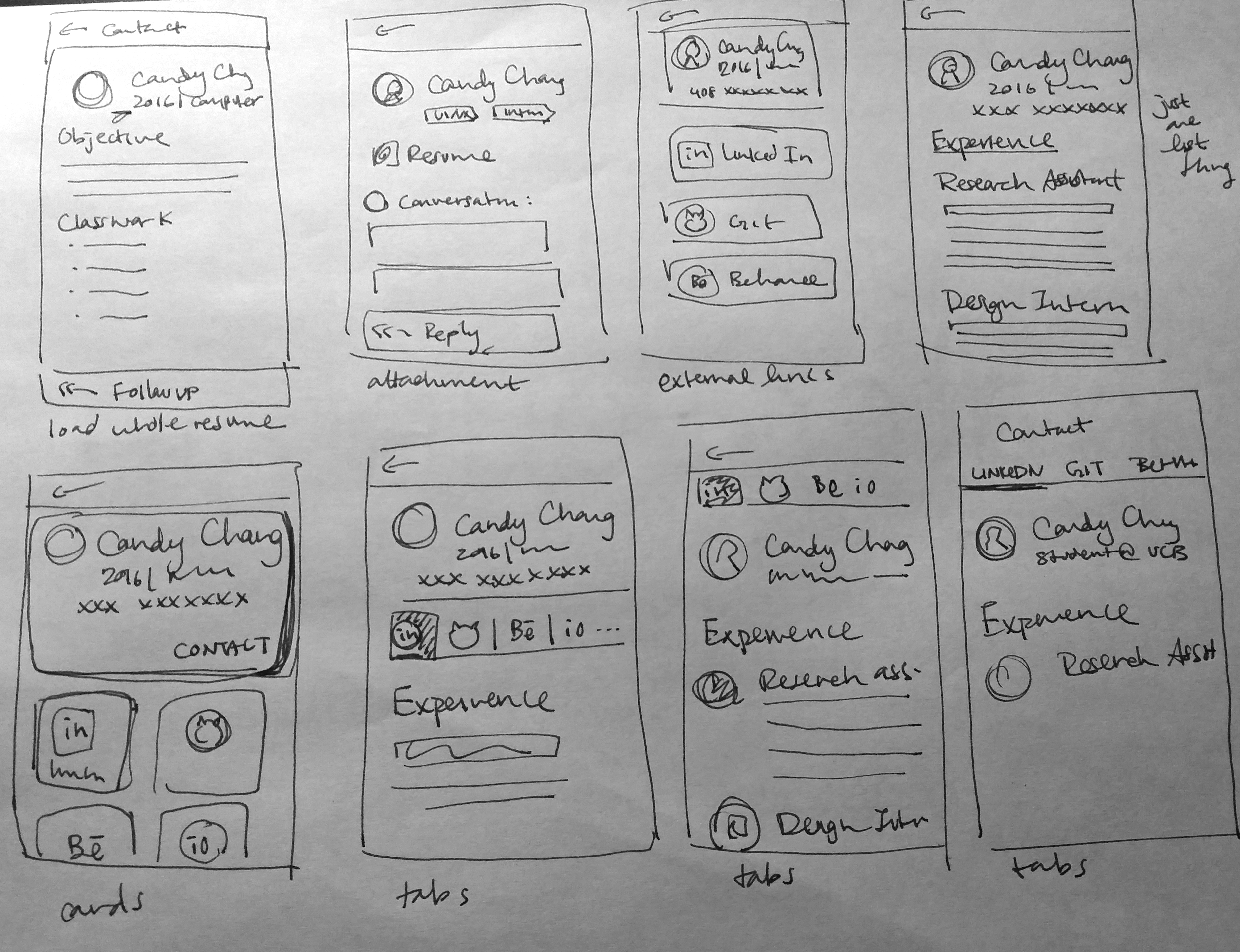
The biggest challenge for the mobile views was working out how to fit so much information within a small screen. I ended up going with an accordion pattern, with the main job title and company visible and details hidden by default.
Final Thoughts
I learned a lot about designing around limitations during this project. The watch form factor influenced all our technical and product decisions; we had to set aside several of our ideas because they didn’t work with the small screen estate or the possible modes of interaction. We also had to consider likely user bases — smartwatches are not ubiquitous, and certain user groups, like high-salaried tech workers, are more likely to have them.
We worked on this project around the time when the Apple Watch was first being promoted. Smartwatch technology and design has advanced since then, and it’s exciting to think that some of our early ideas might be possible to achieve now.
